来一个赛博朋克故障风的按钮
前两天在b站刷到一个教你制作赛博朋克风的按钮的视频,附上视频链接 纯CSS制作赛博朋克2077“故障风”按钮 。里面的一些技术不常用但是酷炫,这里记录一下。
首先直接来看demo及其代码,然后我会一步步的解析代码和其中的要点。
<template>
  <div class="cyberpunk-wrap">
    <link href="https://fonts.font.im/css?family=Do+Hyeon" rel="stylesheet">
    <button class="cyberpunk">AVALIABLE NOW</button>
  </div>
</template>

<style>
.cyberpunk-wrap {
  display: flex;
  justify-content: center;
  align-items: center;
  min-height: 400px;
  background-color: #f8f005;
}

.cyberpunk,.cyberpunk::after {
  position: relative;
  width: 380px;
  height: 86px;
  font-size: 36px;
  background: linear-gradient(45deg, transparent 5%, #ff013c 5%);
  border: 0;
  color: #fff;
  letter-spacing: 3px;
  line-height: 88px;
  box-shadow: 6px 0px 0 #00e6f6;
  outline: transparent;
  font-family: 'Do Hyeon', sans-serif;
  cursor: pointer;
}

.cyberpunk::after {
  --slice-0: inset(50% 50% 50% 50%);
  --slice-1: inset(80% -6px 0 0);
  --slice-2: inset(50% -6px 30% 0);
  --slice-3: inset(10% -6px 85% 0);
  --slice-4: inset(40% -6px 43% 0);
  --slice-5: inset(80% -6px 5% 0);

  content: 'AVALIABLE NOW';
  display: block;
  position: absolute;
  top: 0;
  left: 0;
  right: 0;
  bottom: 0;
  background: linear-gradient(45deg, transparent 3%, #00e6f6 3%, #00e6f6 5%, #ff013c 5%);
  text-shadow: -3px -3px 0px #f8f005, 3px 3px 0px #00e6f6;
  clip-path: var(--slice-0);
}

.cyberpunk:hover::after {
  animation: 1s glitch steps(2, end);
}

@keyframes glitch {
  0% {
    clip-path: var(--slice-1);
    transform: translate(-20px, -10px);
  }

  10% {
    clip-path: var(--slice-3);
    transform: translate(10px, 10px);
  }

  20% {
    clip-path: var(--slice-1);
    transform: translate(-10px, 10px);
  }

  30% {
    clip-path: var(--slice-3);
    transform: translate(0px, 5px);
  }

  40% {
    clip-path: var(--slice-2);
    transform: translate(-5px, 0px);
  }

  50% {
    clip-path: var(--slice-3);
    transform: translate(5px, 0px);
  }

  60% {
    clip-path: var(--slice-4);
    transform: translate(5px, 10px);
  }

  70% {
    clip-path: var(--slice-2);
    transform: translate(-10px, 10px);
  }

  80% {
    clip-path: var(--slice-5);
    transform: translate(20px, -10px);
  }

  90% {
    clip-path: var(--slice-1);
    transform: translate(-10px, 0px);
  }

  100% {
    clip-path: var(--slice-1);
    transform: translate(0);
  }
}
</style>
画个按钮
来简单画一个静立在黄色面板里的缺口红色按钮。
首先是 html
<button>AVALIABLE NOW</button>
然后是样式
body {
  display: flex;
  justify-content: center;
  align-items: center;
  min-height: 100vh;
  background-color: #f8f005;
}

button {
  position: relative;
  width: 380px;
  height: 86px;
  font-size: 36px;
  background: linear-gradient(45deg, transparent 5%, #ff013c 5%);
  border: 0;
  color: #fff;
  letter-spacing: 3px;
  line-height: 88px;
  box-shadow: 6px 0px 0 #00e6f6;
  outline: transparent;
}
2
3
4
5
6
7
8
9
10
11
12
13
14
15
16
17
18
19
20
21
效果如图

知识要点
linear-gradient() 函数
为了实现按钮左下角缺口,使用了 linear-gradient() 函数,该函数用于创建多种颜色渐变的图片。使用方式为 linear-gradient(<direction>, <color-stop1>, <color-stop2>, ...);
direction:角度,顺时针旋转color-stop1:分为color和stop,第二个值stop是颜色起止的位置,如果相邻两个颜色起止位置一样,则两个颜色之间为硬朗的分界线(如按钮的 transparent 和 红色 的起止位置都是 5%)
box-shadow
右边框蓝色阴影,使用方式为 box-shadow: <h-shadow> <v-shadow> <blur> <spread> <color> <inset>;
h-shadow:必需的。水平阴影的位置。允许负值v-shadow:必需的。垂直阴影的位置。允许负值blur:可选。模糊距离spread:可选。阴影的大小color:可选。阴影的颜色inset:可选。从外层的阴影(开始时)改变阴影内侧阴影
故障按钮
接下来使用伪元素增加一个故障风的按钮,基础样式与原button一致。
button,
,button::after {
  /* button 的样式 */
}

button::after {
  content: 'AVALIABLE NOW';
  display: block;
  position: absolute;
  top: 0;
  left: 0;
  right: 0;
  bottom: 0;
  background: linear-gradient(45deg, transparent 3%, #00e6f6 3%, #00e6f6 5%, #ff013c 5%);
  text-shadow: -3px -3px 0px #f8f005, 3px 3px 0px #00e6f6;
}
2
3
4
5
6
7
8
9
10
11
12
13
14
15
16
效果如图

知识要点
text-shadow
这里使用文字阴影 text-shadow 实现了多重文字震颤的效果,使用方式为 text-shadow: <h-shadow> <v-shadow> <blur> <color>;
h-shadow:必需。水平阴影的位置。允许负值v-shadow:必需。垂直阴影的位置。允许负值blur:可选。模糊的距离color: 可选。阴影的颜色
图形剪裁
接着就是设置动画要使用的剪裁图形变量了,这里会将伪元素故障按钮切成一个个长条形状,为后面动作闪现做准备
button::after {
  --slice-0: inset(50% 50% 50% 50%);
  --slice-1: inset(80% -6px 0 0);
  --slice-2: inset(50% -6px 30% 0);
  --slice-3: inset(10% -6px 85% 0);
  --slice-4: inset(40% -6px 43% 0);
  --slice-5: inset(80% -6px 5% 0);

  /* ... */

  clip-path: var(--slice-0);
2
3
4
5
6
7
8
9
10
11
知识点
clip-path
使用 clip-path 可以将元素剪裁出自己想要的形状,用法为 clip-path: <function>;,可用函数:
inset(<top>, <right>, <bottom>, <left> round <top>, <right>, <bottom>, <left>):相对四条边距离裁剪<top>, <right>, <bottom>, <left>必需,可简写。是相对于对应边的距离round <top>, <right>, <bottom>, <left>可选。与border-radius用法相似eg:
clip-path: inset(50% -6px 30% 0);
url(<svg>):剪裁路径来自 SVG clipPath 元素polygon(<x1> <y1>, <x2> <y2>, ...):多边形,指定每个裁剪路径上的点坐标- eg:
clip-path: polygon(0 0, 50% 0, 50% 100%, 0 100%)
- eg:
circle(<radius> at <x> <y>):圆形radius:圆半径at <x> <y>:圆心坐标eg:
clip-path: circle(10px at 20px 10px)
ellipse(<x-radius> <y-radius> at <x> <y>):椭圆形x-radius:x轴半径y-radius:y轴半径at <x> <y>:圆心坐标eg:
clip-path: ellipse(20px 10px at 20px 10px)
var()
var() 函数可以使用 css 变量,css 变量只能使用在 css 属性的值上,不能设置为 css 属性名以及其他值。css 变量的声明方式为在 {} 代码块内声明 -- 加变量名即可。例如:
:root{
  --color: red;
}
div {
  color: var(--color);
}
2
3
4
5
6
制作动画
动画中随机出现上面剪裁好的故障按钮条,并用 translate 给故障按钮条一点位移
button:hover::after {
  animation: 1s glitch steps(2, end);
}

@keyframes glitch {
  0% {
    clip-path: var(--slice-1);
    transform: translate(-20px, -10px);
  }

  10% {
    clip-path: var(--slice-3);
    transform: translate(10px, 10px);
  }

  20% {
    clip-path: var(--slice-1);
    transform: translate(-10px, 10px);
  }

  30% {
    clip-path: var(--slice-3);
    transform: translate(0px, 5px);
  }

  40% {
    clip-path: var(--slice-2);
    transform: translate(-5px, 0px);
  }

  50% {
    clip-path: var(--slice-3);
    transform: translate(5px, 0px);
  }

  60% {
    clip-path: var(--slice-4);
    transform: translate(5px, 10px);
  }

  70% {
    clip-path: var(--slice-2);
    transform: translate(-10px, 10px);
  }

  80% {
    clip-path: var(--slice-5);
    transform: translate(20px, -10px);
  }

  90% {
    clip-path: var(--slice-1);
    transform: translate(-10px, 0px);
  }

  100% {
    clip-path: var(--slice-1);
    transform: translate(0);
  }
}
2
3
4
5
6
7
8
9
10
11
12
13
14
15
16
17
18
19
20
21
22
23
24
25
26
27
28
29
30
31
32
33
34
35
36
37
38
39
40
41
42
43
44
45
46
47
48
49
50
51
52
53
54
55
56
57
58
59
60
知识点
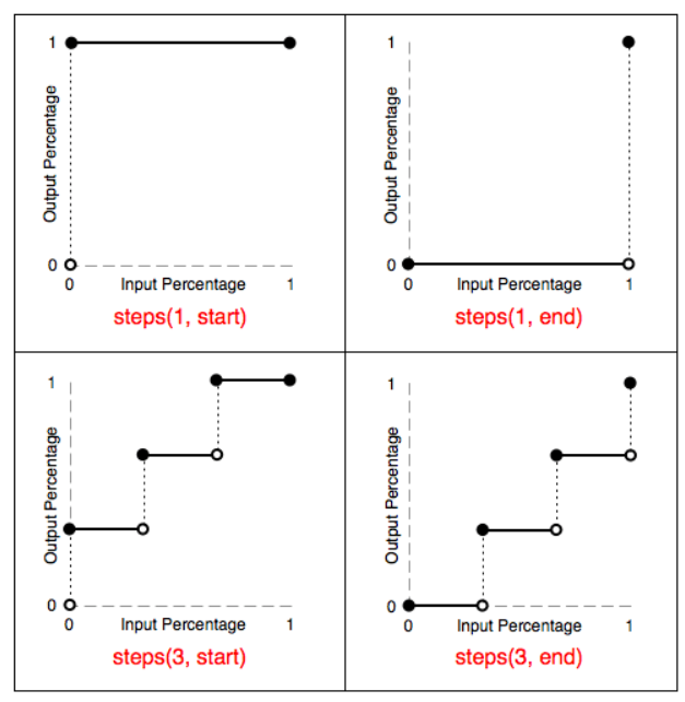
steps()
animation-timing-function 属性中使用,可使动画达到不连续的效果,使用方法为 steps(<number>, <position>)
nunber:必需。时间函数中间隔数量position:可选。start或end
steps() 函数刨析图
参考链接
linear-gradient: https://www.runoob.com/cssref/func-linear-gradient.html
box-shadow: https://www.runoob.com/cssref/css3-pr-box-shadow.html
clip-path: https://www.zhangxinxu.com/wordpress/2014/12/css3-svg-clip-path/
var: https://www.zhangxinxu.com/wordpress/2016/11/css-css3-variables-var/
steps: https://www.w3cschool.cn/lugfe/lugfe-6vyb25zm.html
← React模块配置型渲染 CSS 案例展示 →